Bev Dalton
Mixed Media Artist
Other Projects
“Ghost Paintings”
(2014)
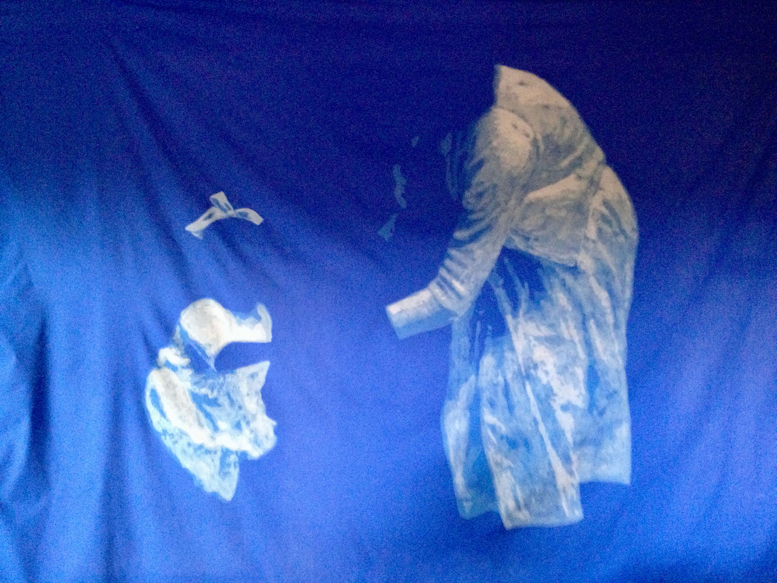
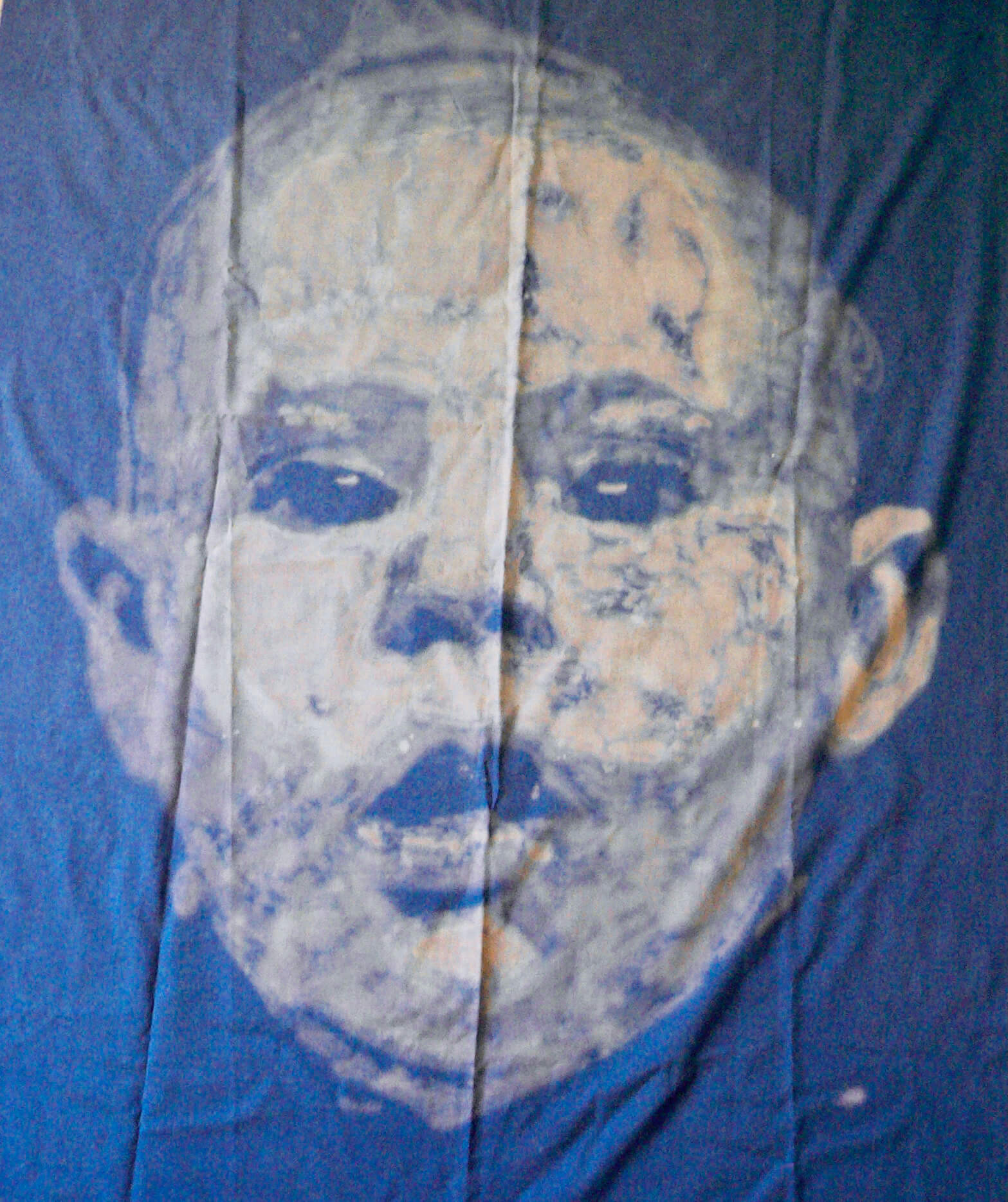
These old family photos were bleached into sheets – a long and slow process that involved working on a few square inches at a time, using bleach with a retardant mixed in to slow the spread, then quickly dunking into cold water as soon as the image had begun to take shape. Rinse, dry, iron, repeat. A lot. (And try not to get a bit muddle-headed cos of the fumes.)
I was considering the idea of how much our past informs our present, yet how unreliable some of those memories – those ‘ghosts’ of the past – can be. Hence, in the big picture, it’s just the clothes. (Notice how we fill in the gaps of where the faces and arms should be? Yeah, weird, that.)
“Abstract Paintings”
(2014)
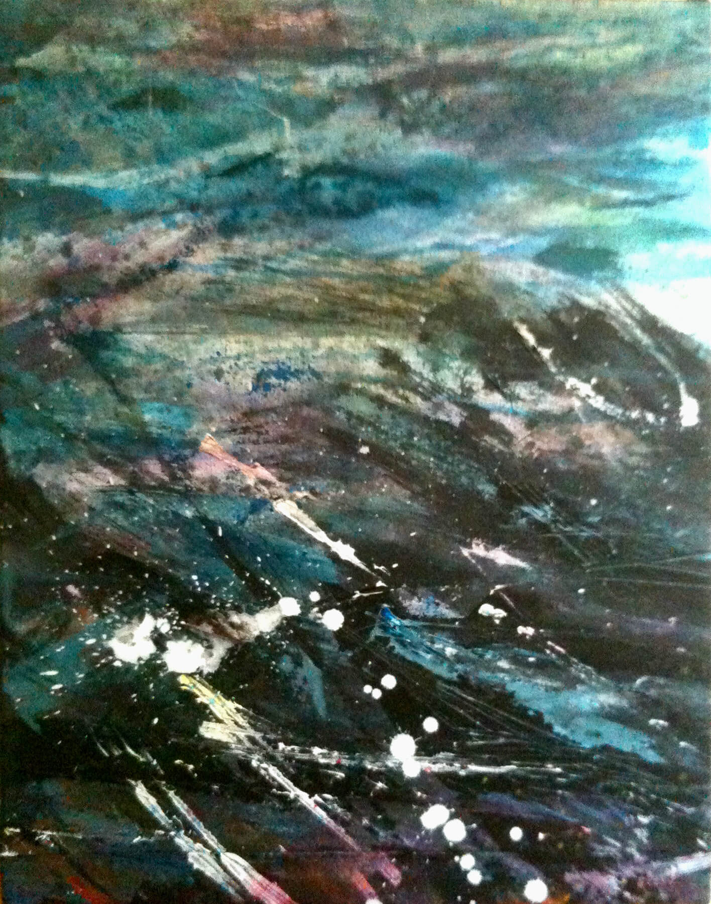
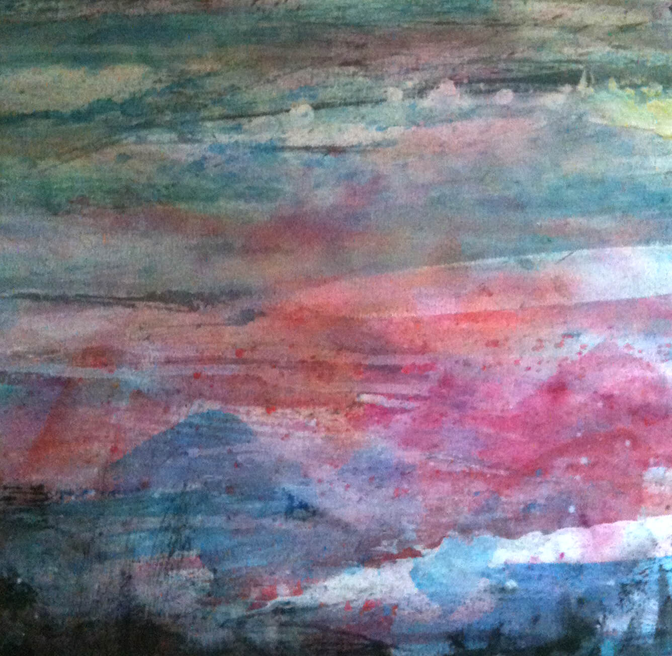
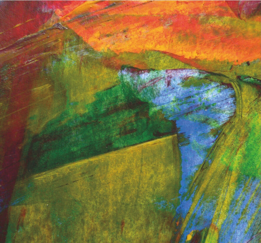
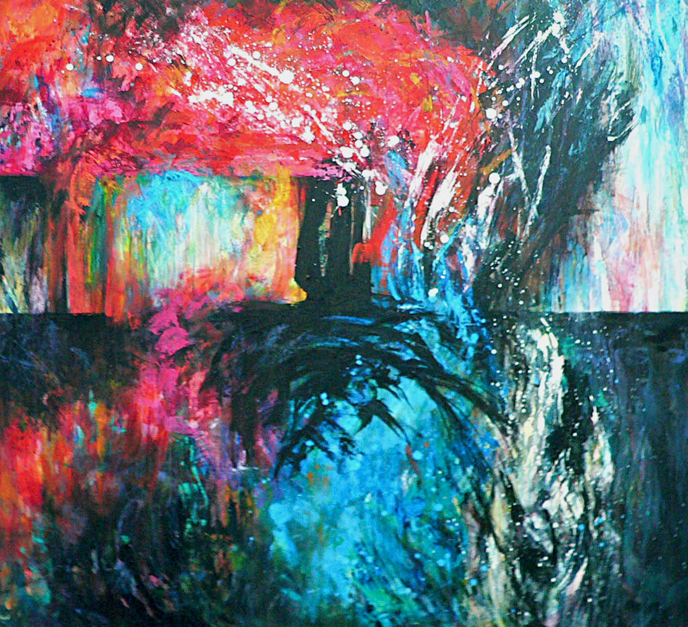
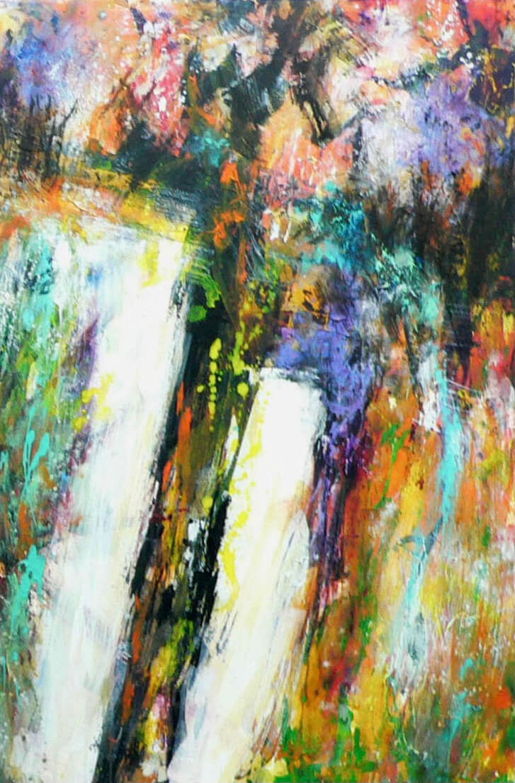
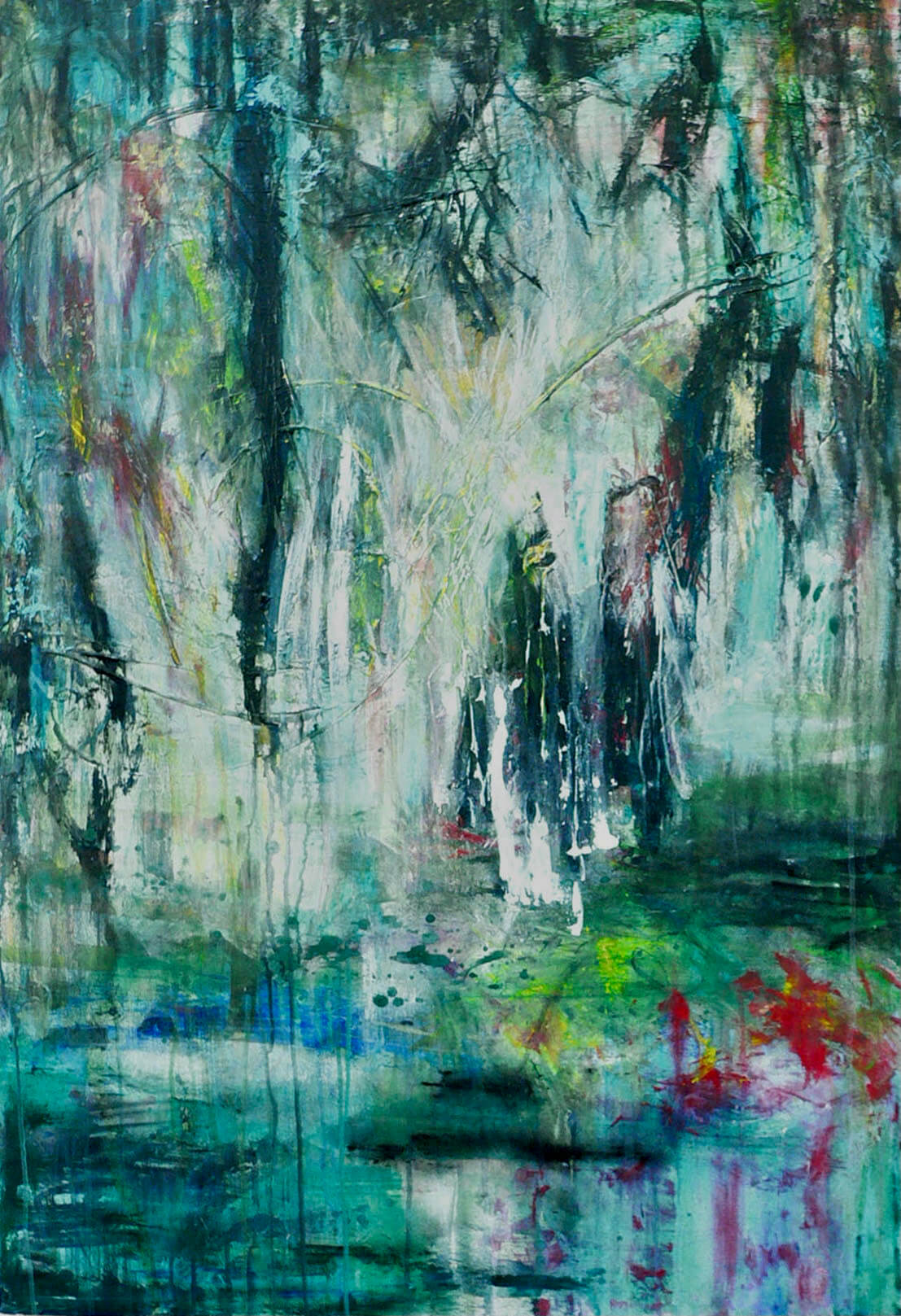
Info: Mostly worked in acrylic on canvas, I focussed on finding different tools and techniques to layer the paint onto the canvas, creating dreamscape images that had latent energy in the marks and washes. (Which, in reality, just means they’re kinda lumpy and tactile.)


“U”
(2016)
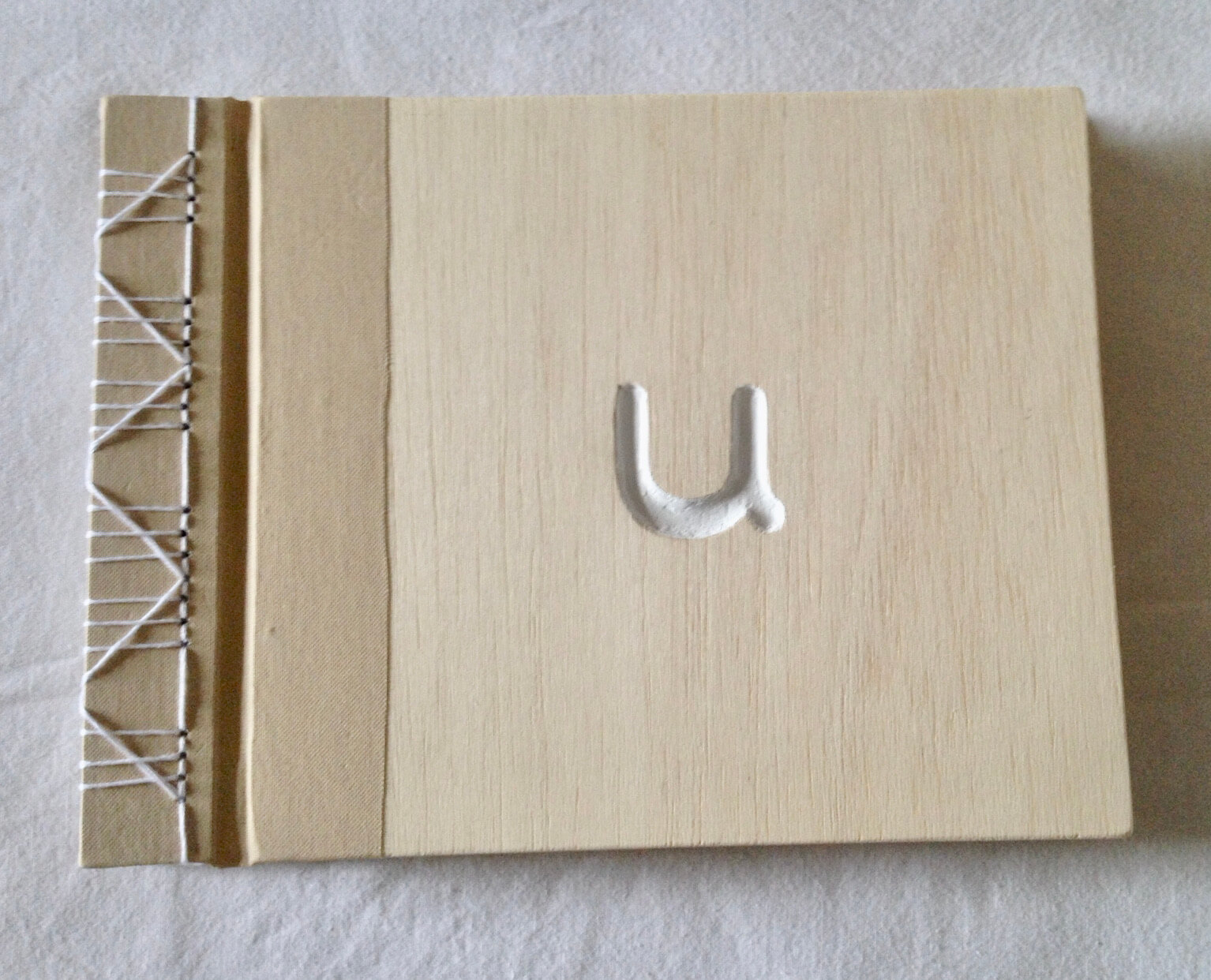
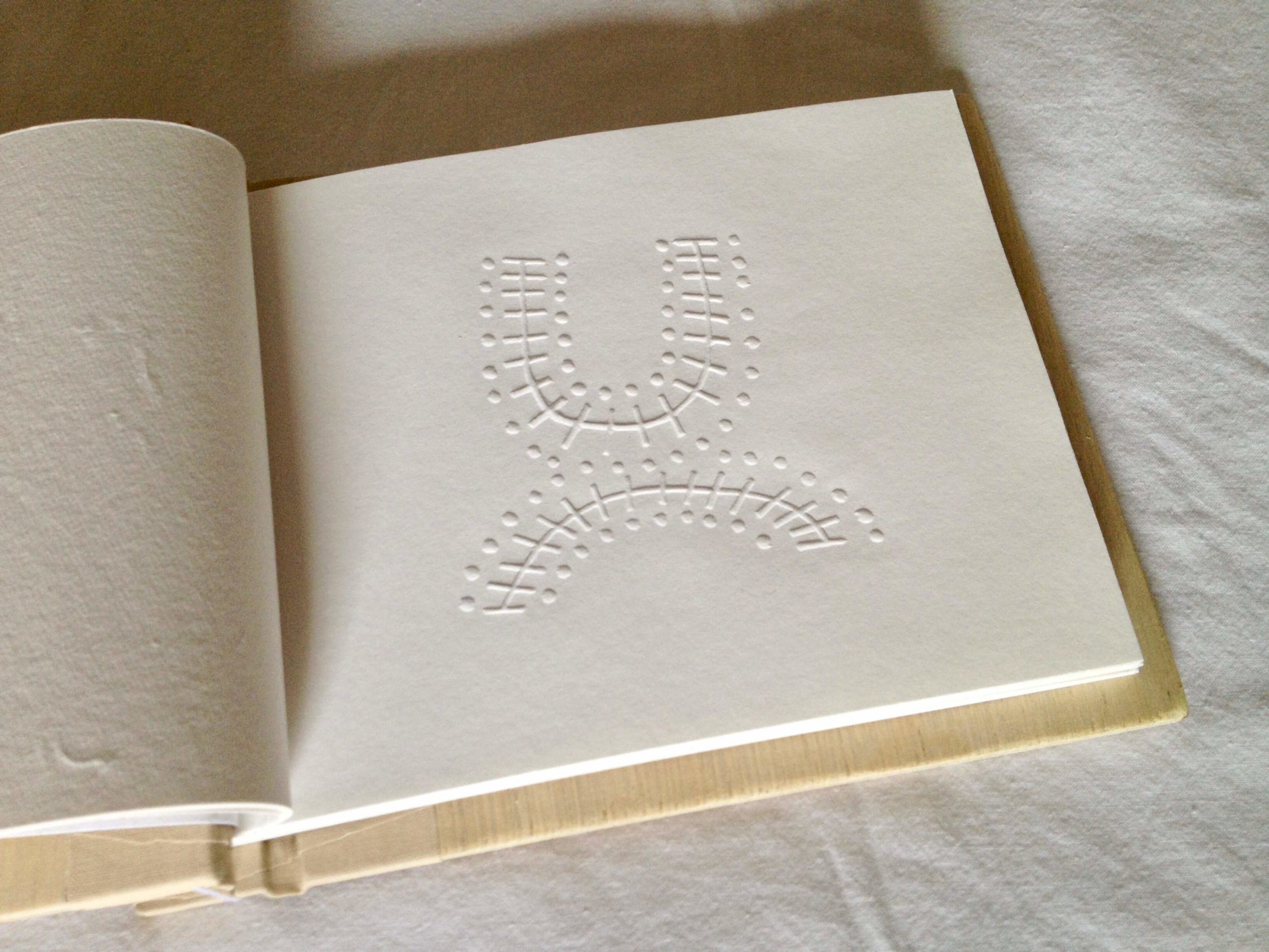
A book I made, with a carved wooden cover and Japanese stab-binding. It features a series of embossed pages, created from lino-cuts.
The idea that sparked this was my interest in ancient Norse Runestones – I love how the human race has always placed great significance on any mark permanently inscribed into a surface. I created a series of images that looked as if they came from our Neolithic history, to see how people would respond to them.
Would they see things in the images that actually weren’t there? Trees, the sun, water, etc.? Yes, they did, almost without exception.
Would they treat these random images with greater reverence because of the manner of their presentation, and the ‘carved’ feel of them? Yup, they did that too.
(Except my nephew, who I gifted it to as a wedding present: he thought it was a photo album.)

Pi
(2016)
This is about to get a bit heavy-going, so brace yourselves.
I love colour (this is the nice bit, to ease you in gently), and my motto has always been, Why use five colours when fifty will do?
But I’ve been a painter for about a hundred years (give or take) and now I spend a lot of time using a screen to view art. So I’ve switched from a Subtractive system of colour to an Additive one (STAY WITH ME!).
In real life, the spectrum of sunlight hits an object and some of the wavelength of that light is absorbed by the object. What isn’t absorbed is bounced back into our eyes. What is left over is what we see. So some of it has been ‘subtracted’. An object we perceive as yellow has had all but the yellow part of the light spectrum absorbed, so only the yellow is left for us to see. (How are we doing – you still there?)
Now computers use a different system, obviously. They just fling the coloured light straight at you. So that is an Additive system. They just add together the colour combo they need and beam it out. (Take a breath.)
THIS IS ONE OF THE REASONS WHY YOUR PHOTOS NEVER LOOK THE SAME PRINTED OUT AS THEY DO ON-SCREEN. (You can spout this stuff at parties – you’ll look super-smart.)
So, there’s me, at Uni, looking for a new project, and thinking about colour, and how the delivery system is changing. And I wonder what a computer would choose to do if it could make the Art as well? What would it do?
(You might want a stiff drink at this point, as it’s about to get complicated.)
Computers are all about numbers, and one of the most important numbers is Pi – the endless God of mathematics. So how do I do Pi in colour?
Well, first I get it switched into hexadecimal – the numbering system that is used by computers, cos it gives more options than decimal. (We’re nearly there, so just stick it out a bit longer.)
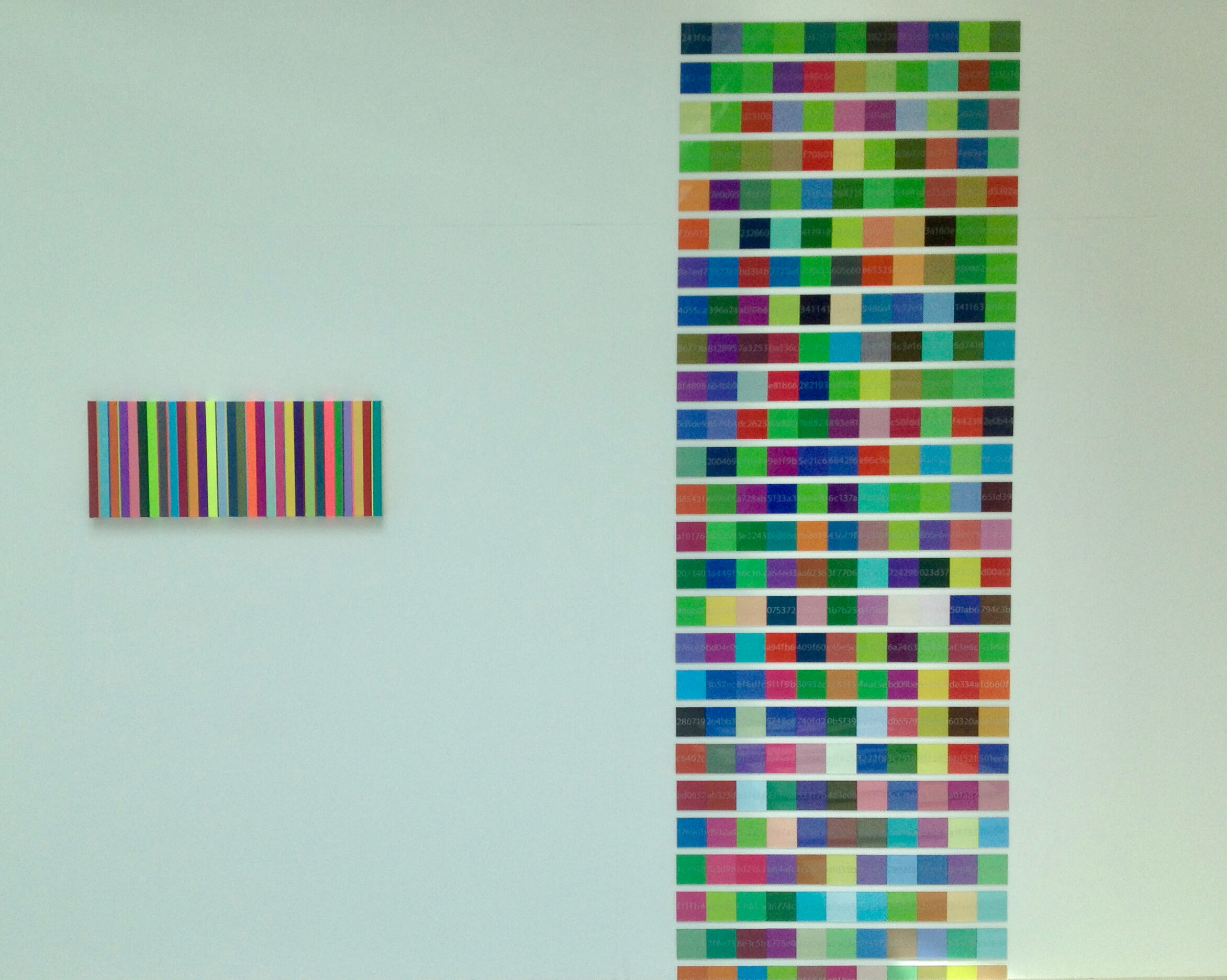
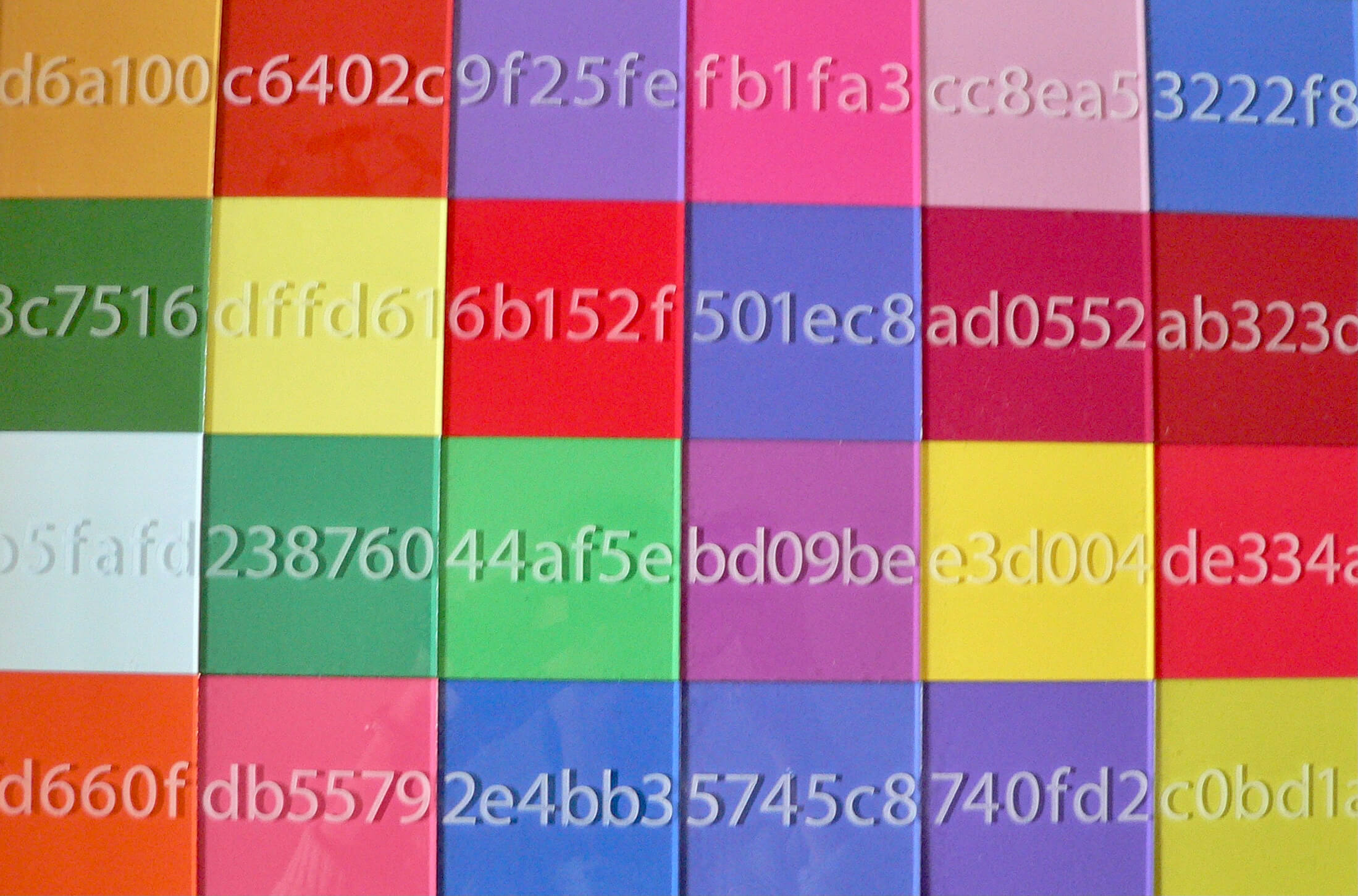
Then I take the first six digits of that and see what colour that represents on Photoshop (a dark blue, since you ask), then the next six (a greyish mauve), and so on, until I have identified about 800 colours. Lots of greens. Lots.
(Last bit, and I’m going to say this fast.) I get them printed off on photographic paper (so the colour is still ‘chosen’ by the computer) which I stick onto squares (like pixels, right?) of Perspex (like a screen – am so on a roll!), and each square has the number etched into it by a CNC router (another computer doing the work. And also creating a ‘touch-screen’ effect).
Then I stick them on a wall and the whole thing measures about 4 metres high. (Phew. We got there. Pat yourselves on the back.)
It lives up the stairwell of a big hotel in Bath now: where nobody cares what it’s about, cos it just looks pretty and a bit like a modern stained-glass window.
Screenprints
(2014)
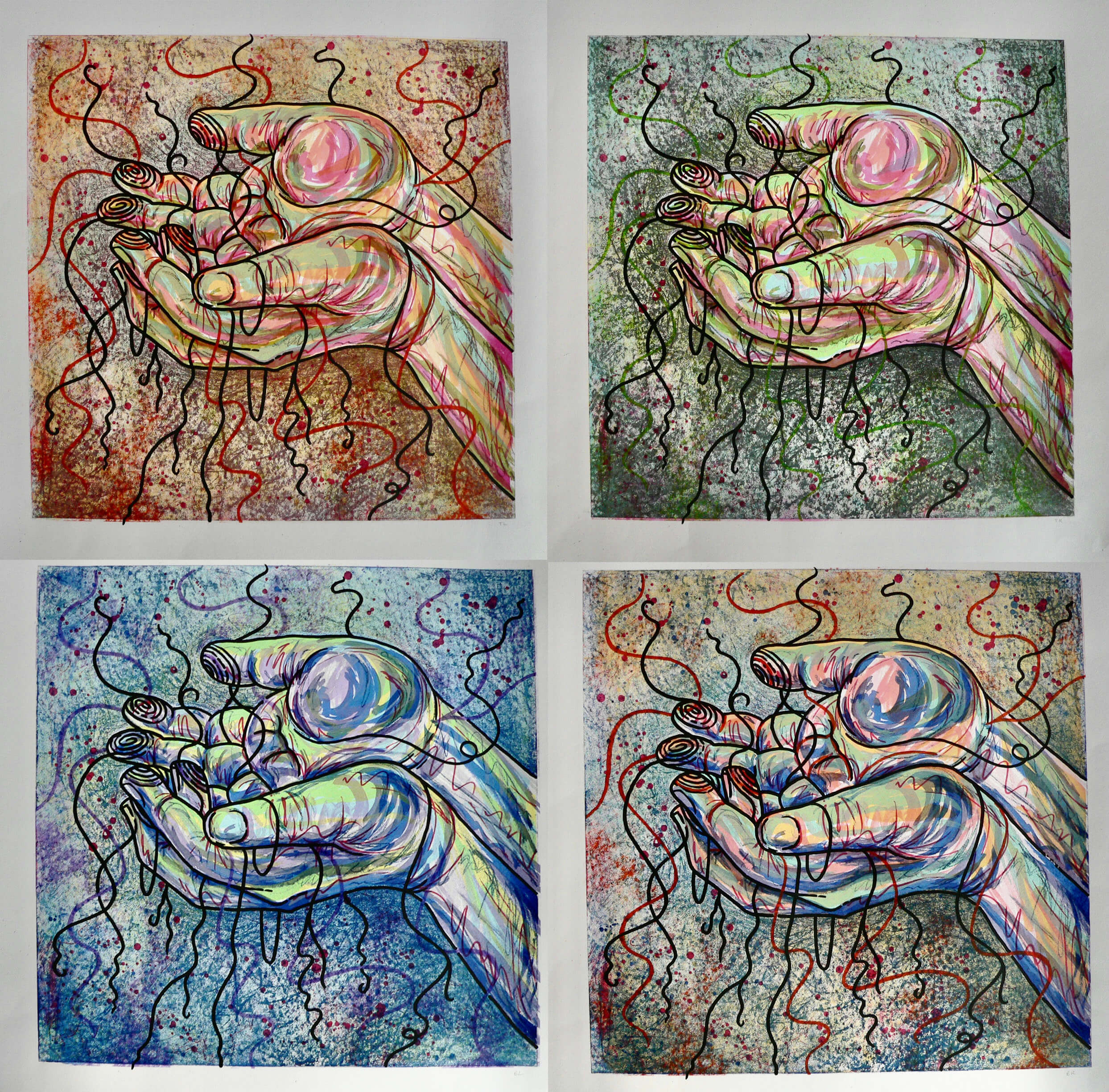
Hands, with the fingerprints unravelling and trailing off. Symbolising how our identity is influenced by our relationships to others. (Yeah, that’s it. Nothing deeper than that. I did about 22 different colour combinations. Cool, eh?)
Sum of the Parts
(2014)
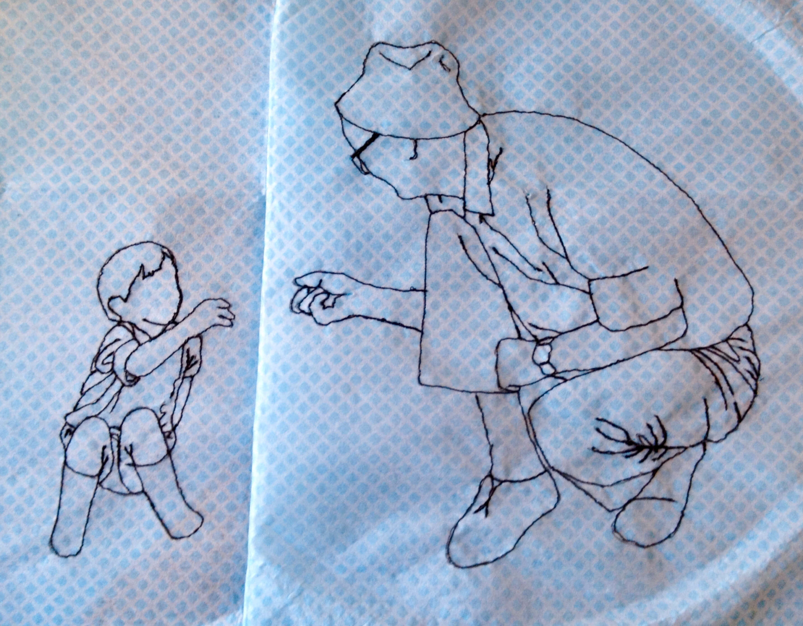
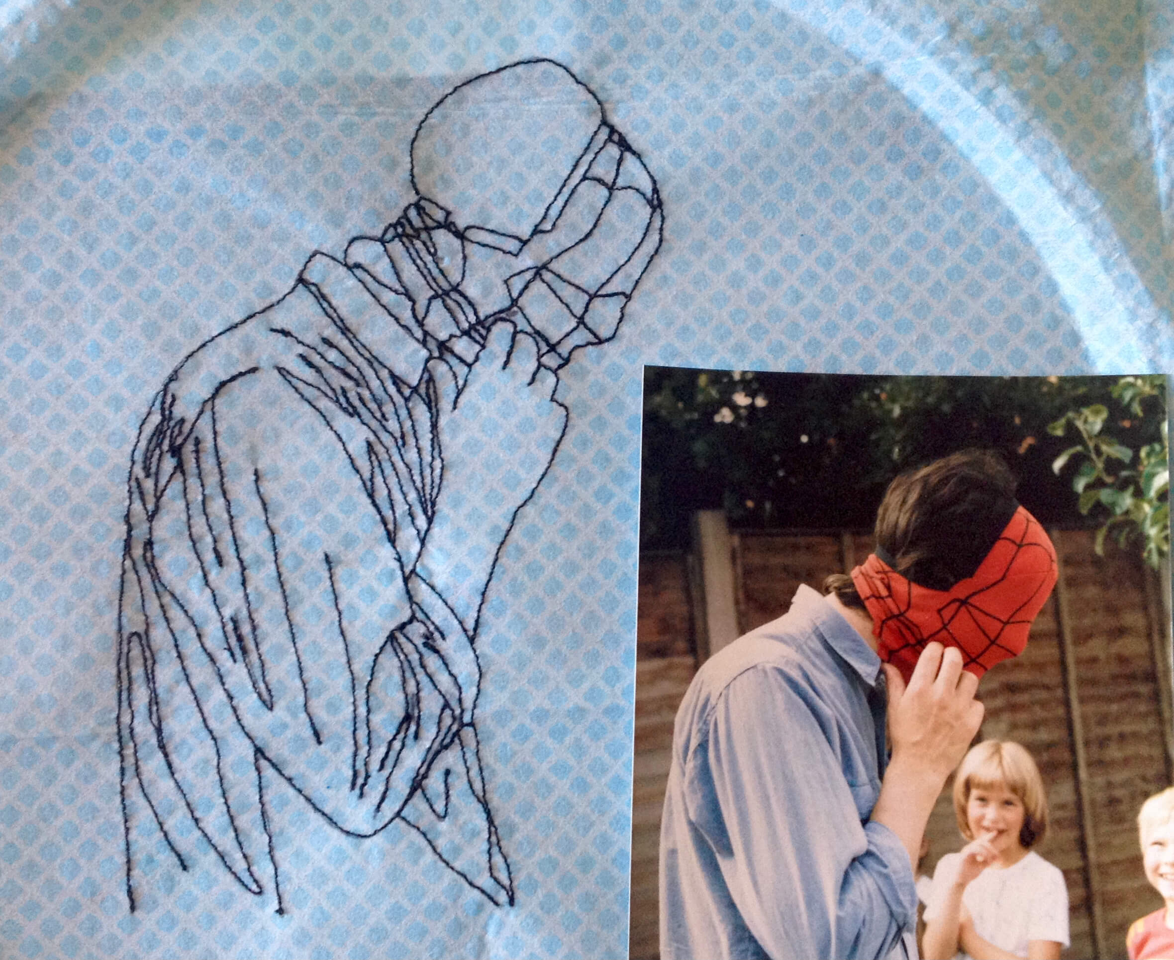
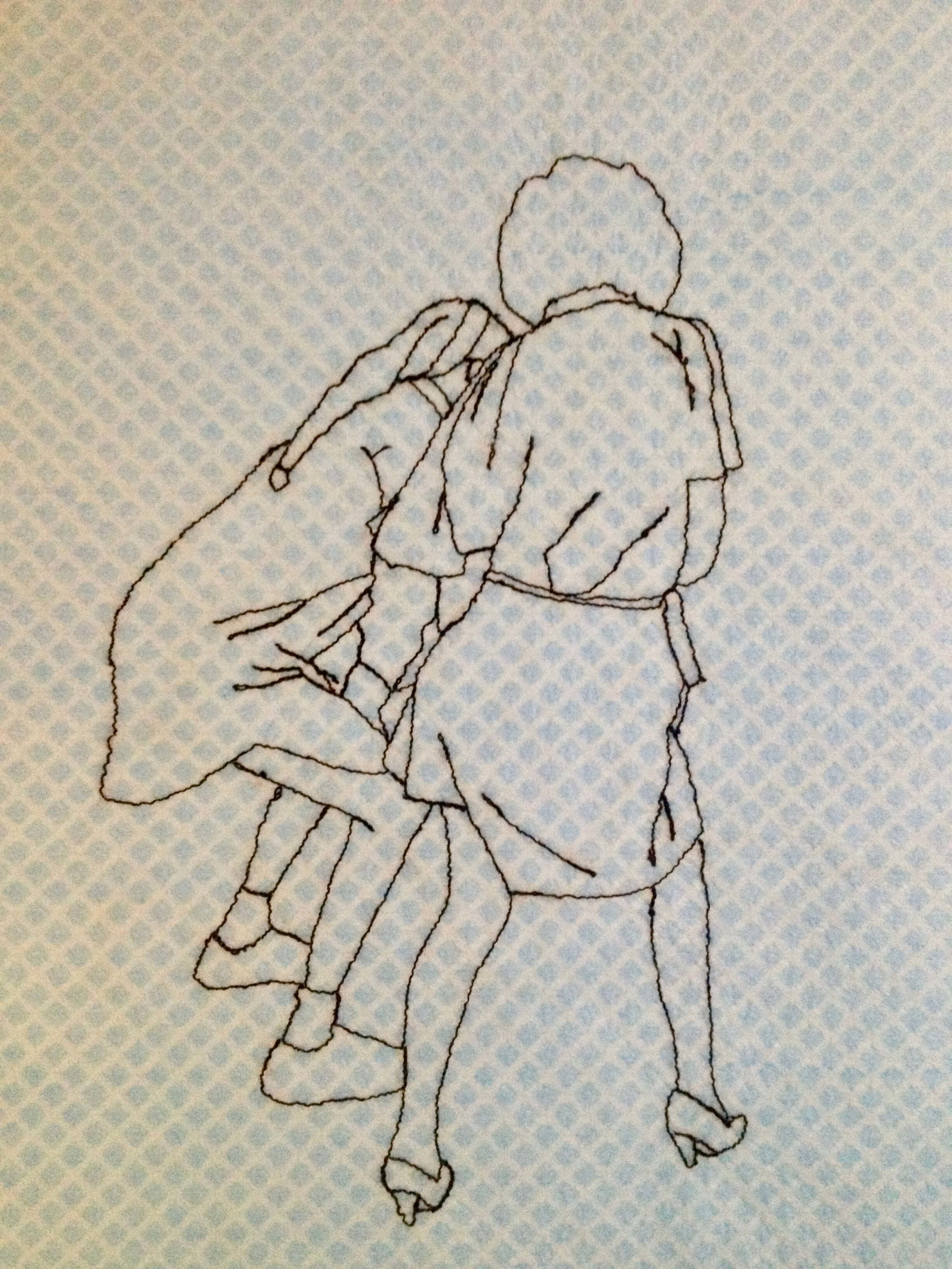
Companion work to the bleached Ghost Paintings included this book, made entirely of J-cloths into which are meticulously stitched family photos. The ambiguity of the faceless images combined with the softness and mundanity of the materials gives them a beguiling charm. (Or creepiness. Especially the one of my brother donning a spiderman mask, to play Blind-man’s-bluff at a birthday party.)
